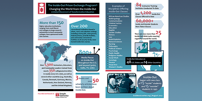
Inside-Out Infographic Poster
The infographic from the 2017 Annual Report was so popular, I was asked to create a poster version for the 20th Anniversary conference for The Inside-Out Center. This version is the February 2021 iteration of the infographic. Click below for the latest version and to see how it has evolved periodically over the years.
Rutgers University – Continuing Education
A few years ago, I created a series of icons in Adobe InDesign, for use in illustrating online coursework for a department at Rutgers University. All colors presented were in accordance with the Rutgers Identity Manual.
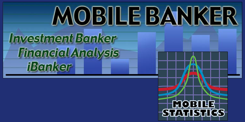
Business Compass
As one of my smaller projects, I was asked to design a graphic banner and an app icon for Business Compass.

FunnelVision
FunnelVision, based in Florida, requested a logo and a look that conveyed a sense of playfulness, elegance, and speed.
Presented in the accompanying image are the company business card and a booth display banner.
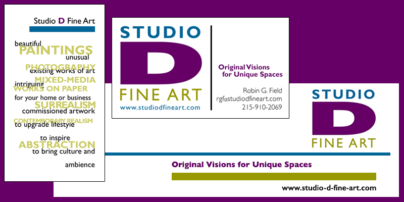
Studio D Fine Art
With Studio D, the 'D' was of utmost importance, with a design that needed to be both sweetly quirky and artfully sophisticated.
ARRO logo
When I recreated the ARROAutism website in 2025, I saw that they also needed an updated logo. In designing such, I considered both meaning and aesthetics. Autism is a radial spectrum, not linear, and the gold color in the arrow reflects the chemical symbol AU. It all ties together.
You can find this logo on their new website here.